New ‘G’: Google’s logo glow-up costs a fortune
Google has secretly unveiled a slight revamp of its famous “G” logo, garnering a lot of attention and igniting internet discussion—not because of the difference in appearance, but rather because of the potential cost of the alteration.
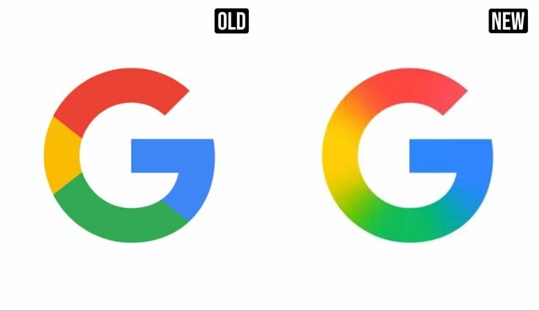
Google’s recognizable red, yellow, green, and blue hues are still present in the redesigned logo, but a seamless gradient transition has taken the place of the formerly separate chunks. Users have taken note of the seemingly little change, and many have resorted to social media to ridicule what they perceive to be a costly and needless alteration. Sarcastic estimates of “a few thousand dollars” and conjectures that a graphic designer made “millions for using the Smudge tool in Photoshop” were among the comments.
Although the redesign’s precise cost has not been made public, branding experts estimate that such adjustments, particularly at Google’s magnitude, may cost millions of dollars. That idea gains support from historical comparisons: the BBC’s 2022 rebranding cost £7 million, whereas Pepsi allegedly paid $1 million for a comparable minor makeover in 2008. A total of $211 million is said to have been spent on BP’s rebranding.
The change seems to have been done by Google as part of a larger visual alignment with the new Gemini AI platform’s design approach. Only the iOS version of the Google Search app has received the updated logo so far, but Android and more services are anticipated to follow. Similar improvements could soon be made to other product icons, including Maps, Gmail, and Chrome.
Even little graphic adjustments may be crucial for preserving uniformity across digital platforms and being current in look, according to branding strategists, despite the online mockery. Although the actual cost of this revamp has not yet been revealed, the amount of public attention it has received indicates that the internet is keeping a close eye on it.